
Document Upload MVP
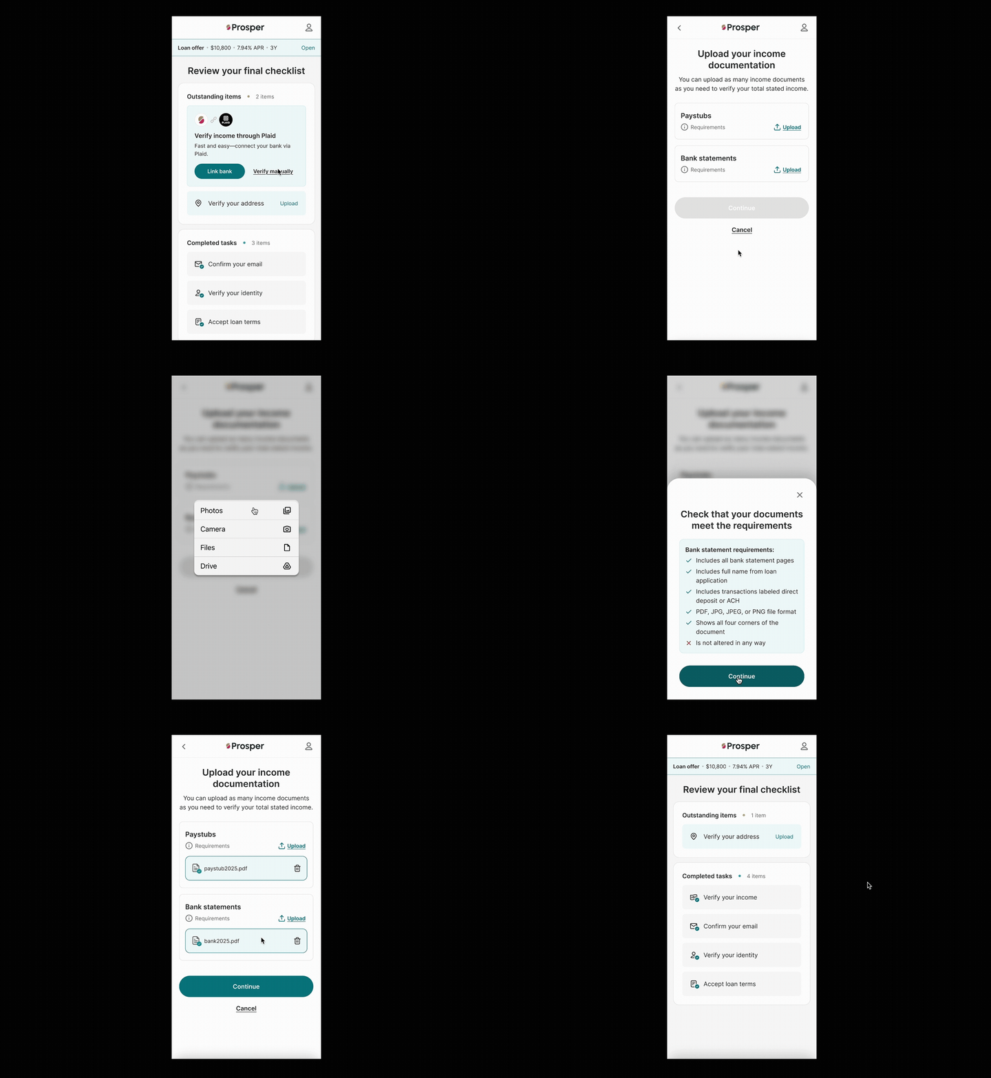
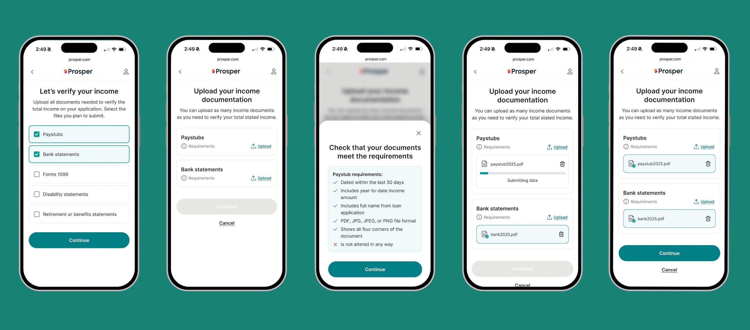
Design work: Q1 - Q2 2026
The Ask
Design a new manual document upload feature for personal loan verification
The feature is intended for specific users who are on “hold” in the loan application process because they need to submit more information
The end product would utilize AI to analyze a document with Inscribe and then automatically reject a document that wasn’t suitable (is blurry, has the wrong date, doesn’t have enough information)
Roles
My role: Lead UX Designer for end-to-end process of Doc Upload MVP. Previous designers created basic layout of dashboard
Collaborators: Product Manager, Content Designer & Design Systems Team (Palette, Fonts, etc)
Problem Statement
Automated pathways for approval (like connecting bank through Plaid) don’t always work for each customer
Customer-uploaded documents are frequently rejected by agents: 30% rejection rate
This adds friction for the user and delays decisioning
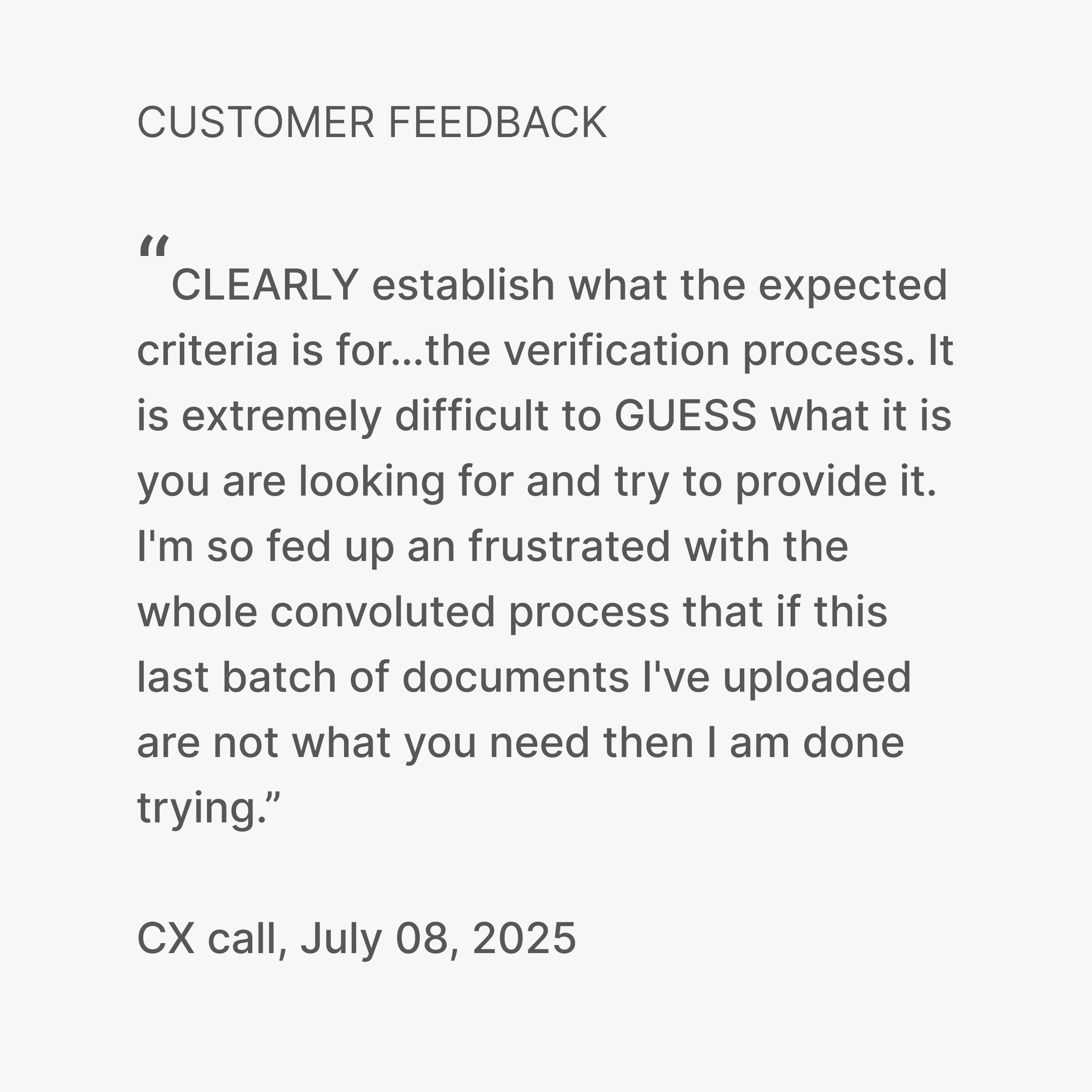
Moreover, our presentation of which documents to upload is overwhelming
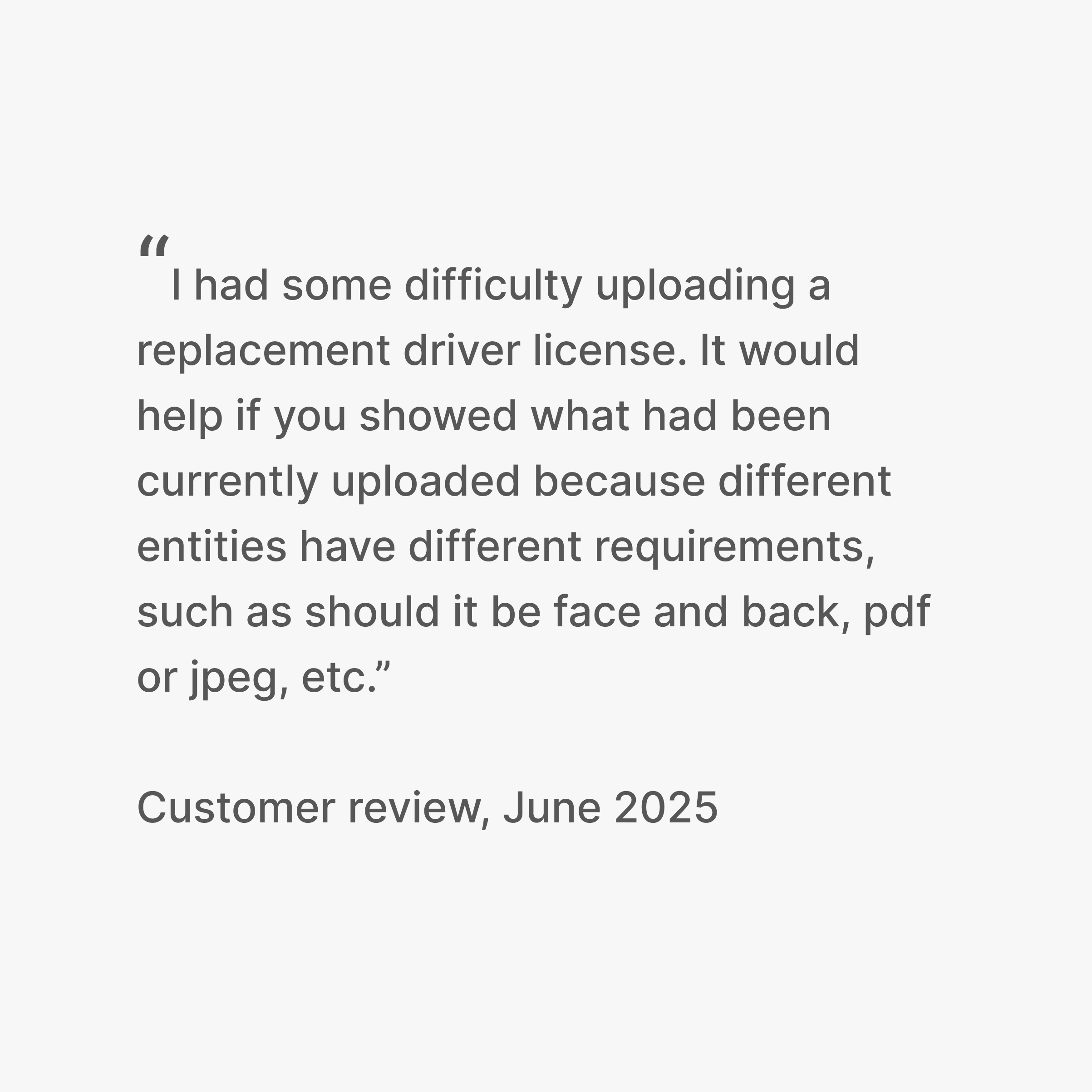
Also, users report being confused due to a lack of clear guidelines
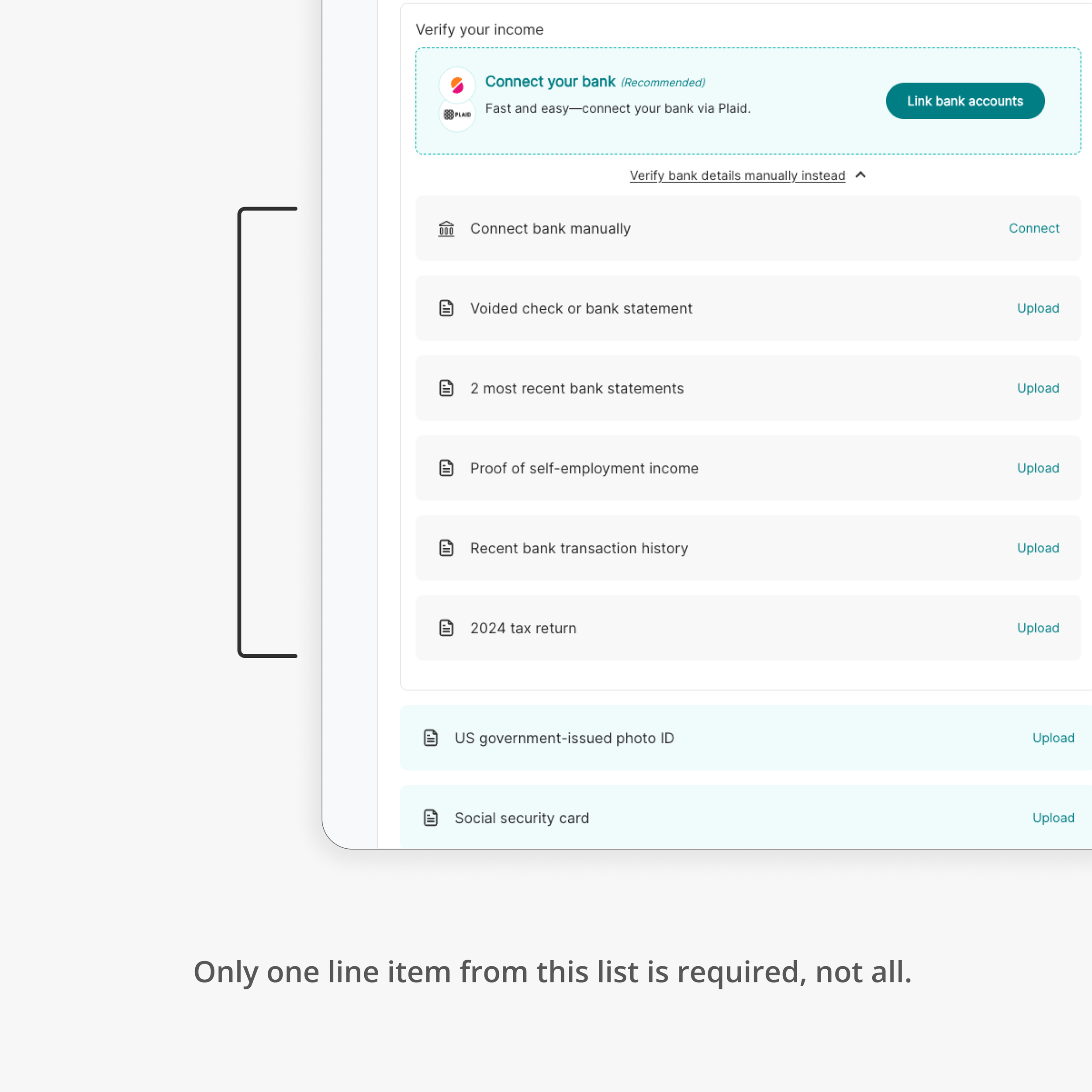
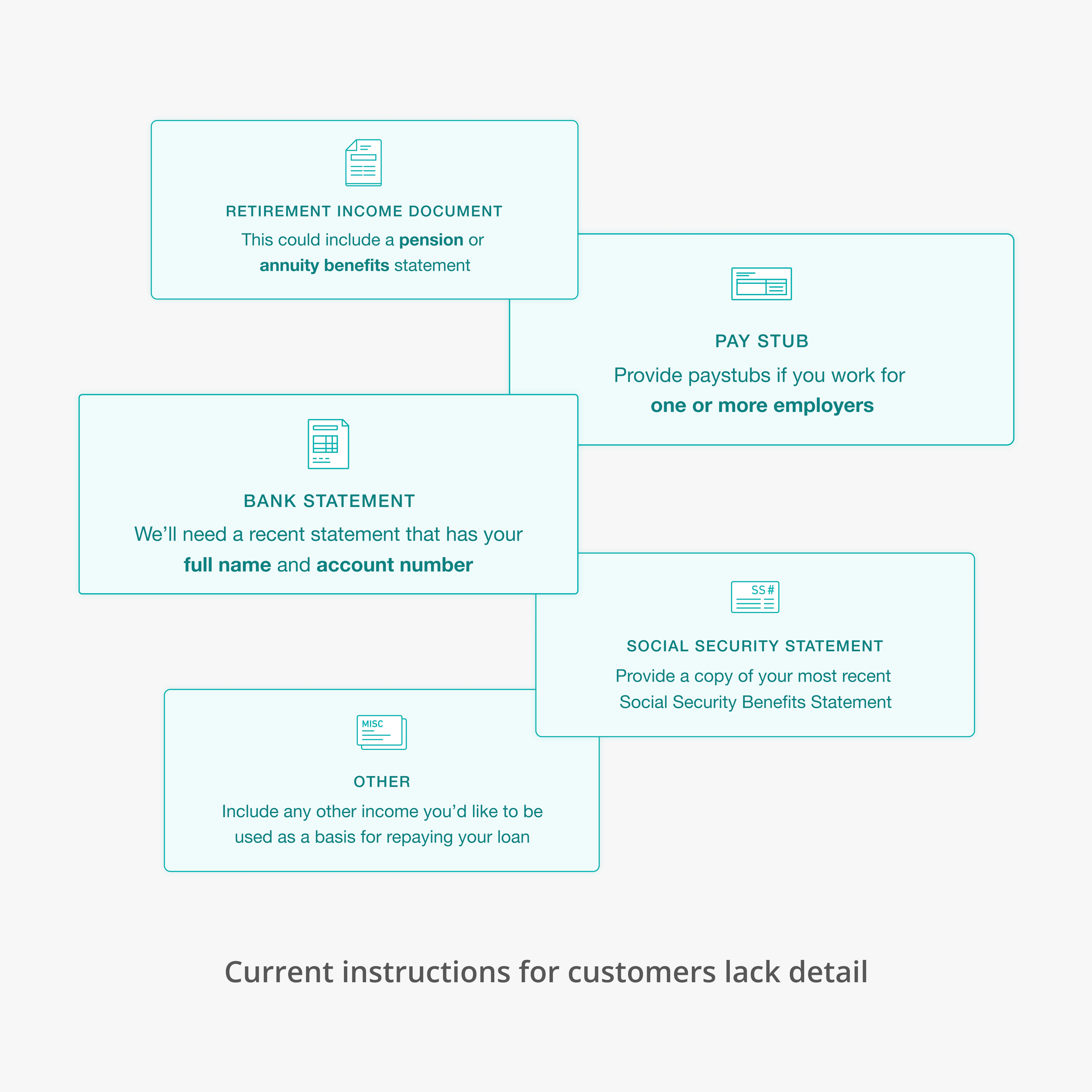
Customer feedback on the original upload process before the redesign

UX Goals
Clarity of requirements
Understanding which documents and how many would clear a hold (ie a requirement to view identity verification or bank ownership verification documents)
Clear feedback of success or failure
Competitive Analysis
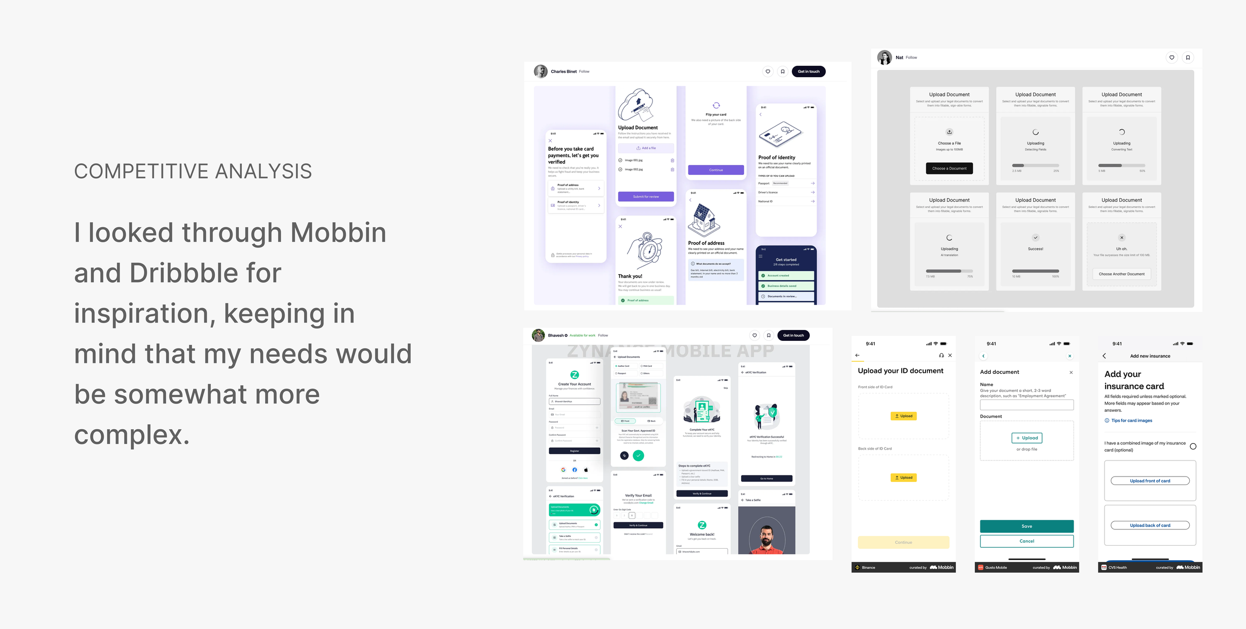
The content writer and I gathered docs in a shared Figma. We were looking for images that showed document requirements and clear feedback
We knew we had complexity to convey so these inspirational images would only be a jumping off point
One thing I liked was keeping the requirements visible at point-of-upload (we had to overcome that 30% failure rate)
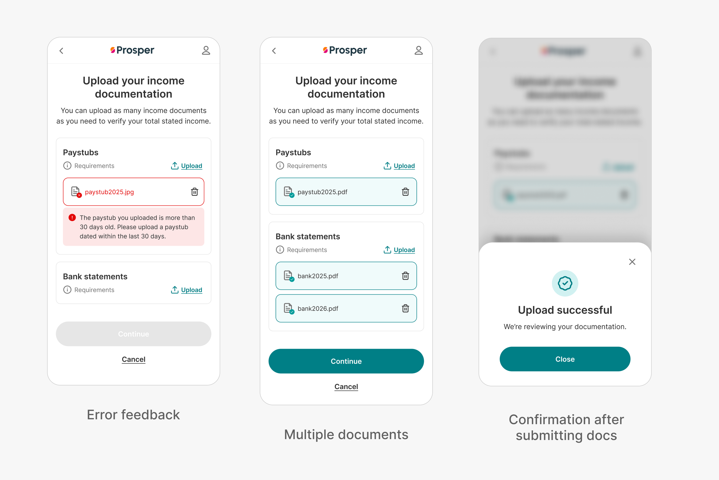
I also liked showing the feedback during and after the uploading process (success or failure)
Technical Constraints
Since we were working in the web, certain features like phone scanning were off limits
Engineers also protested true deletion of documents (although “soft delete” was ok)
Saving a thumbnail image was not scoped for MVP
The MVP would not allow AI to reject a document, it would make a recommendation and compare that to the agent’s analysis
Considering we wanted to generate requirements for all documents instead of the way control bucketed most documents into the “Other” category, we wanted a super flexible template to contain all this text
Design Process
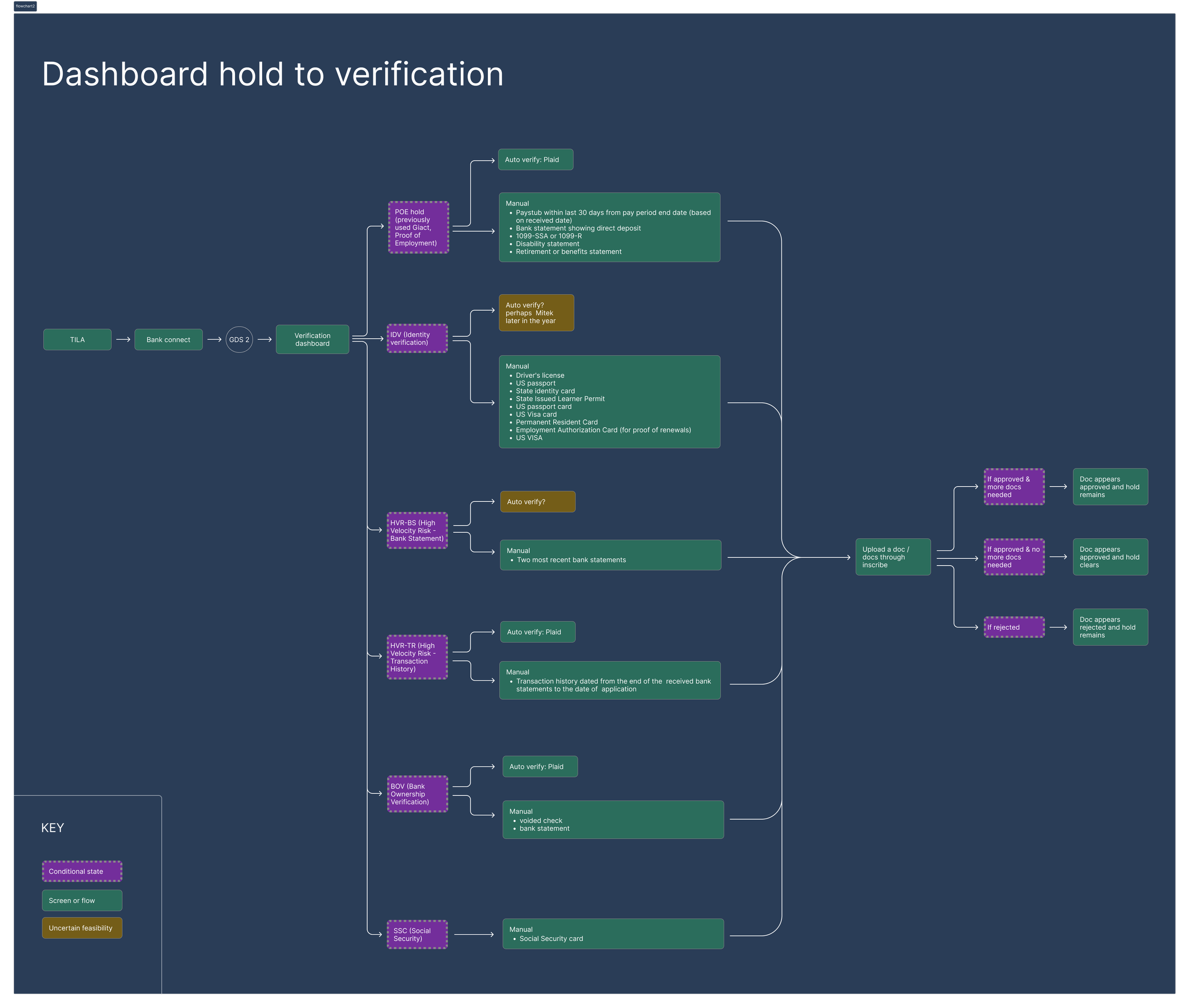
I started with a flowchart of all hold types and backend processes
Initial design direction
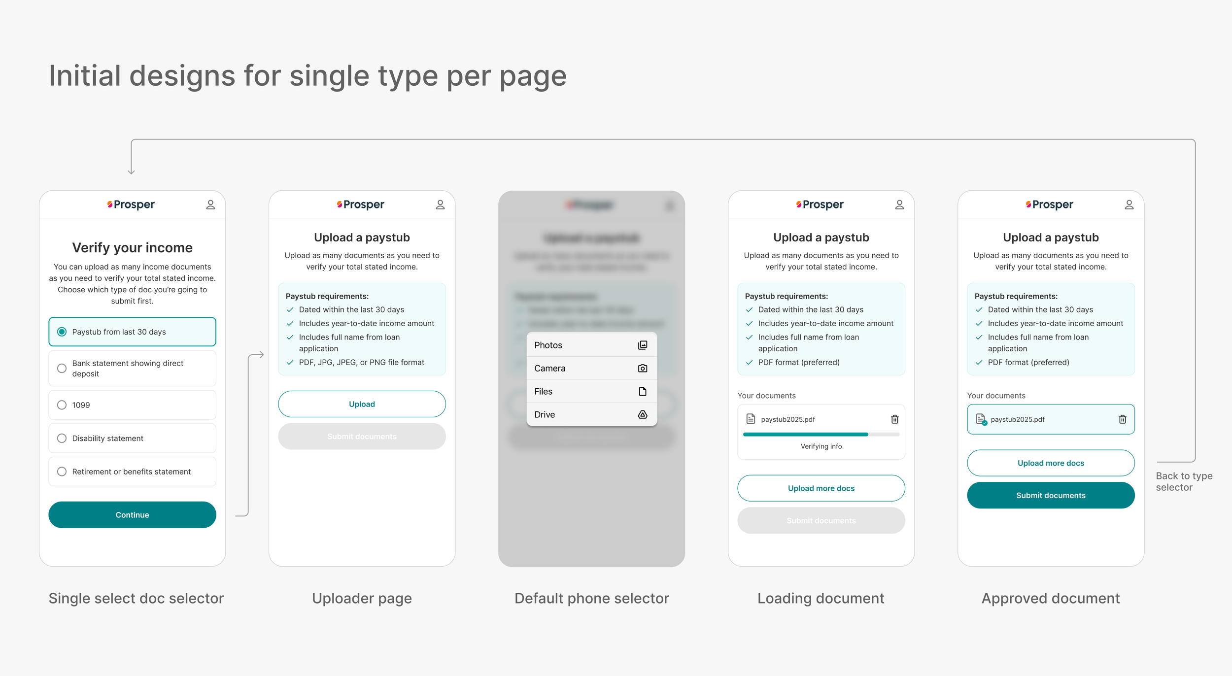
Single type per page was the first design direction. I did not want to confuse people with multiple instructions for different doc types
I tried many layouts and arrived at this design for user testing
User testing results indicated people wanted multi-select because (even though it isn’t required) many users like over-providing documents to ensure they are approved
Overall it was just too limiting of a design
Moving onto Multiselect design
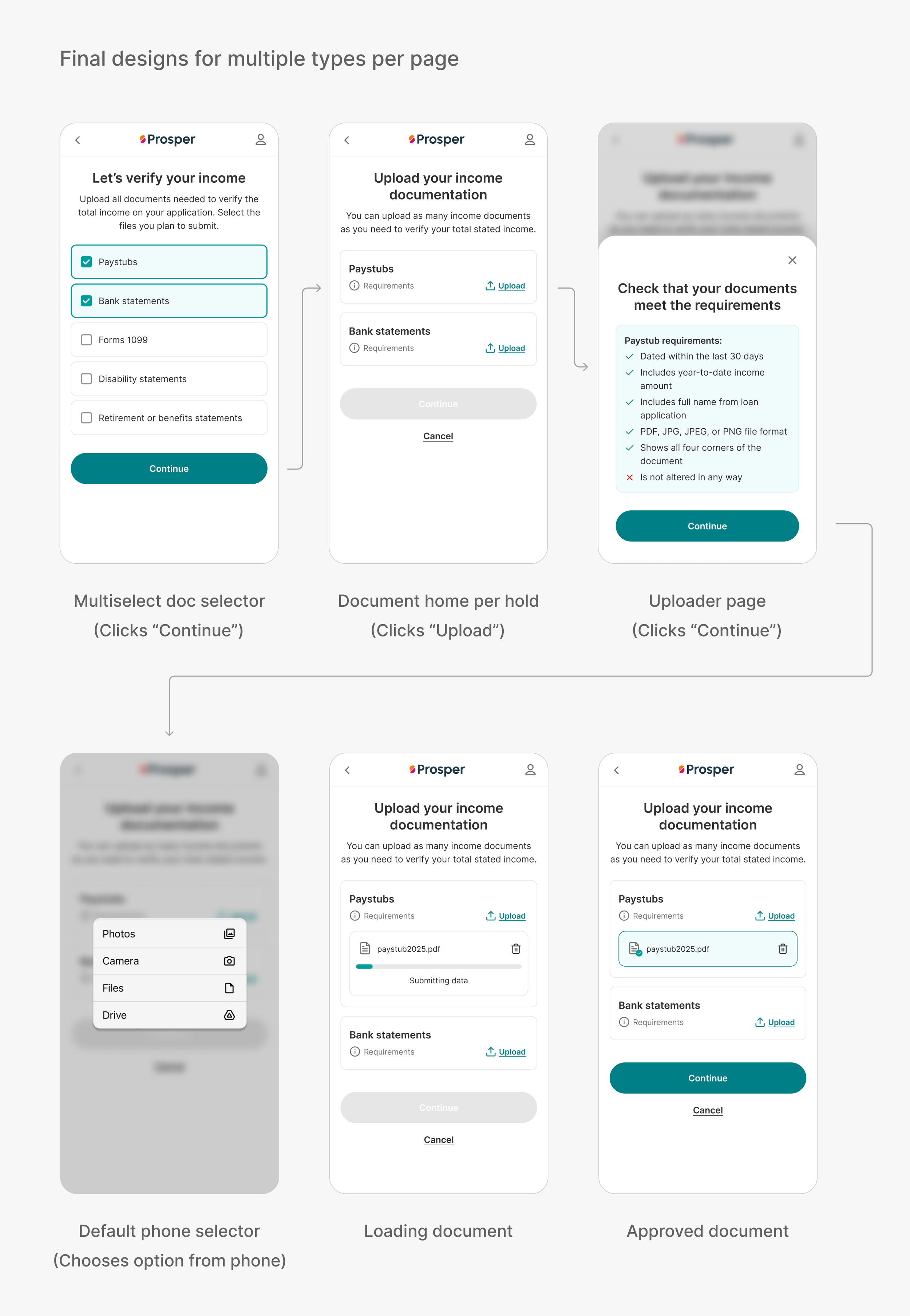
The challenge for the new design was making sure users only saw relevant requirements and were not overwhelmed
Multiselect couldn’t be entirely frictionless: ie uploading all hold types at one. Some order needed to be imposed so that users understood the requirements for each specific type. It’s not that we wouldn’t accept multiple types in one upload, we just wouldn’t show multiple sets of requirements.
Net Results of MVP Test
5 Day L2L $ went from 12.69% in the control to 19.67% in the new variant => 6.98% increase
10 Day L@L $ went from 14.18% in the control to 23.01% in the new variant => 8.83% increase
Full doc listing rate (ie percentage where users uploaded all requested documents) is up 190bps at 25% rollout
Test leads for submissions on SSC, POE, HVR-BS, HVR-TR, and MIL whereas Control leads on IDV and UB
Next steps would be examining how to improve submission for IDV and UB